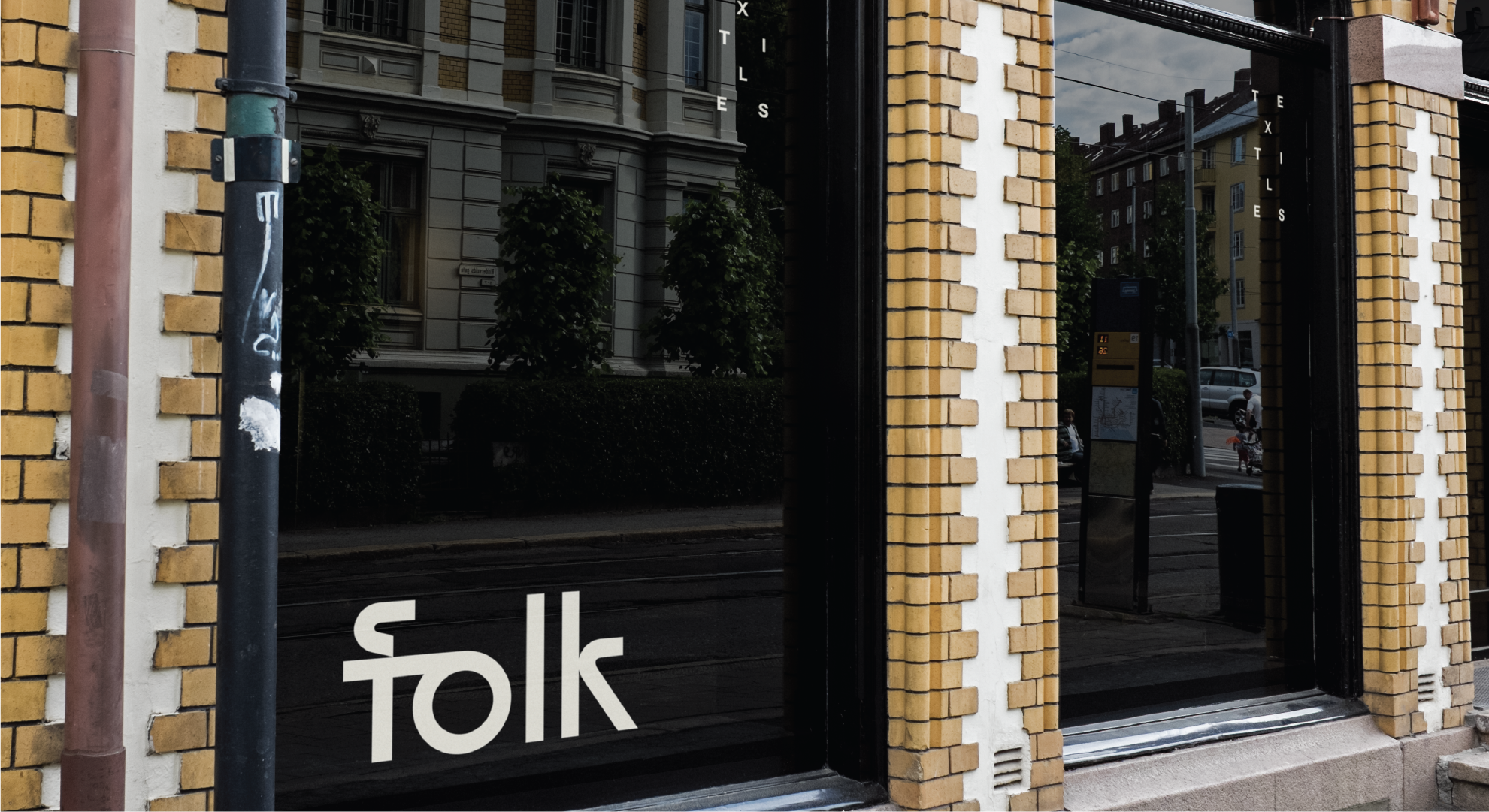
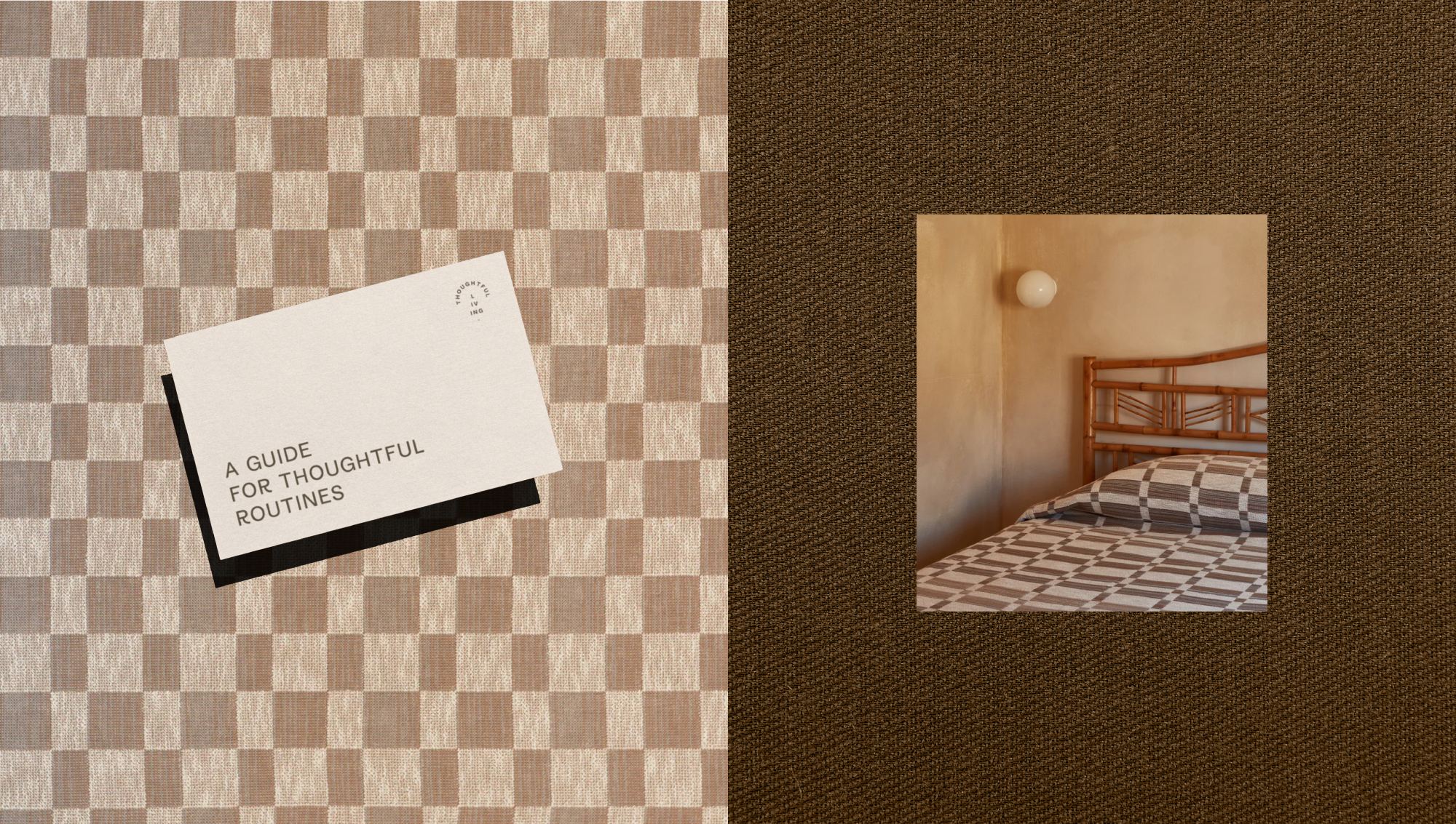
Folk creates intentional, ethically-produced textiles. Intentional angles and curves in the logotype underscore the brand's humble honesty: a perfectly round counter in the letter o and a tall x-height provide friendliness as well as a subtle nod to 70s-style geometric sans-serifs. Patterns made up of type nod to the rhythmic patterns on each product. The branding was awarded a Certificate of Typographic Excellence from the Type Directors Club in 2022.
BRANDING / PACKAGING / WEB DESIGN / ART DIRECTION
(Studio) Freelance
(Role) Sole Designer